Midnight
Watch Online Shows with Friends
Midnight's goal was to recreate the experience of watching broadcast television shows.
We created a cross-platform application for watching synchronized content from Netflix, Amazon, and other streaming services, with friends, live. By eschewing "on-demand," we revived the idea of scheduled shows, which led to engaging and deeper social experiences.
Netflix and Chat
The core experience Midnight aimed to capture is the sense of shared experience while watching broadcast TV. Not only the act of watching, but also the conversations and sense of shared progress. Streaming services as they exist today are wonderful consumption experiences, but they lack the social element. Midnight aimed to fill this "human" element.
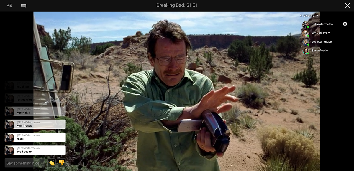
Midnight was a web app, browser extension, and native Andriod and iOS app. It allowed users to watch synchronized Netflix and Amazon shows with their friends and communities, featuring a chat interface to enable social connection.
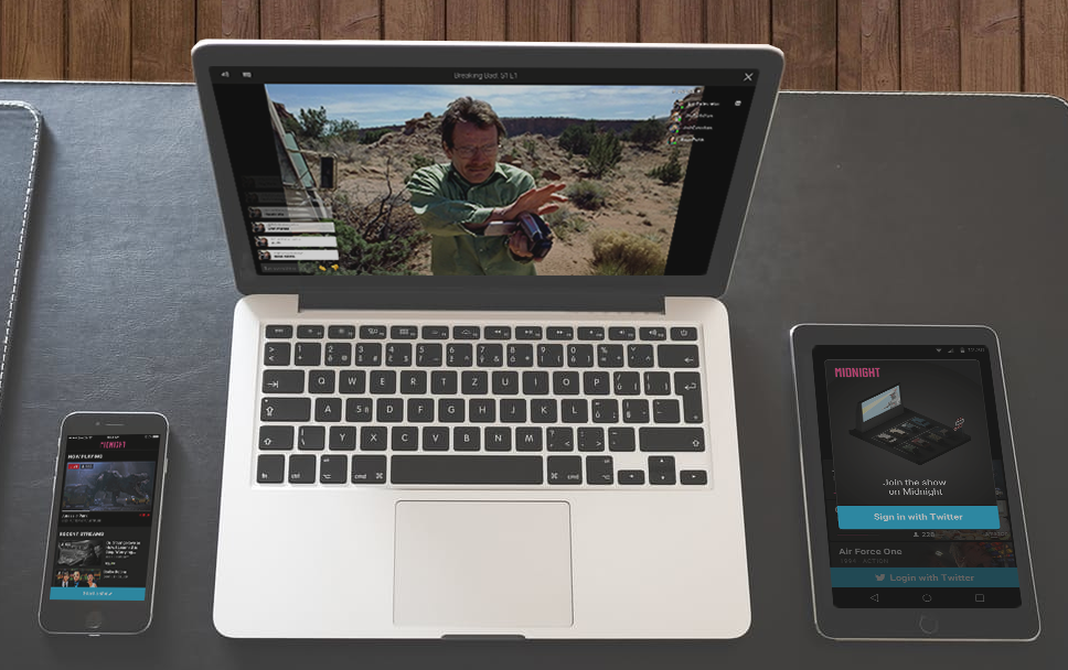
Web, iOS, and Android Support
One big difference between Midnight and other "watch netflix with friends" apps is that Midnight has no notion of "on-demand" or playback control. Users schedule a show to play at a certain time on their station, and like cable broadcast television, people tune in at a specified time to watch.
From On-Demand to Schedules
On-demand is ubiquitous, but with good reason. From pausing live sports events to binge watching entire series, being able to control your content consumption experience is powerful. On-demand provides a great user experience. But, excelling so well at satisfying the individual comes at the expense of social connections. There was something almost magical about tuning in to a TV show and knowing that others were watching it with you, in their own living room, even if it's wasn't live.
Personally, I find it hard to discuss shows with people unless we have both finished watching the entire series or season. Because many shows are now released all at once and because people are often at different episodes even when they do watch the same shows, finding common discussion ground that remains spoiler-free is tricky.
Another problem is that Netflix, Amazon, Hulu, etc. are quite overwhelming. If you don't already have a show in mind, it can be time consuming to find a good one. While the recommendation engines are fantastic, social recommendations often carry more weight. There is no real social component to Netflix's or Amazon's homepage.
Browsing Shows
Taking all these problems into consideration, the solution was to mix the older idea of TV stations and the newer idea of Twitch / YouTube streamers. By combining these two concepts, we arrived at a solution which enables users to create their own "channels." User controlled channels function similar to TV stations, and users schedule playtimes for shows.
When users land on the homepage, the most popular and active channels are surfaced first. This provides social proof, and also reduces cognitive load. Shows will already be playing when you join, similar to TV stations. This makes it easier to quickly hop in. The time commitment feels lower than having to start watching a show from the beginning.
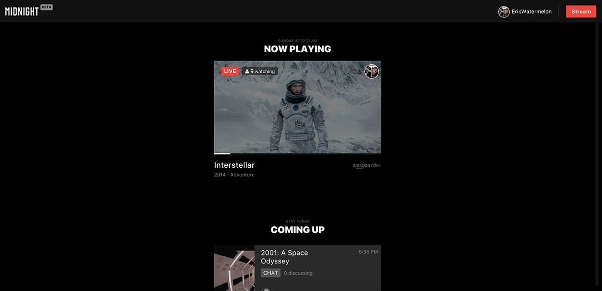
Browse Interface
Shows are sorted by the most users online, along with the ratio of online users to messages sent. This ensures active channels are shown first. After you send a message in a room, that room and rooms similar to it will be given priority on the homepage. This helps ensure that the most active and relevant channels are delivered before others.
After all currently playing channels have been exhausted (or none of your "preferred" channels are playing shows), channels that have upcoming shows are displayed. Users are able to hang out in these channels before a show starts to further build relationships and develop the channel's community.
Individual Channel in Feed
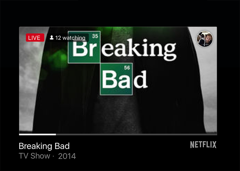
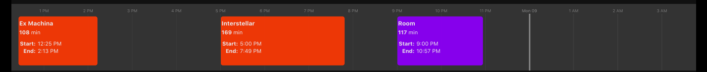
Each channel listed in the feed has a number of properties. Online count is shown in the upper left, and the host's icon is displayed in the upper right. A relevant poster image for the show is shown as the main image backdrop, and the show information is listed below. A white bar takes up the horizontal space. This bar indicates the show's current position.
Shows are synced across all clients. Pausing and skipping to another location is disabled so that all users are watching the same show at the same point in time and can all have real-time reactions.
Initially, the remaining time bar was given much more weight. However, after user testing and using the app personally, the playback time ended up not being only of secondary importance. Nothing prevents users from watching the show directly on Netflix themselves. The value that Midnight provides is watching together, so the social components are given more weight than current playback time. Jumping in late rarely led, surprisingly, to negative experiences
Creating a Channel
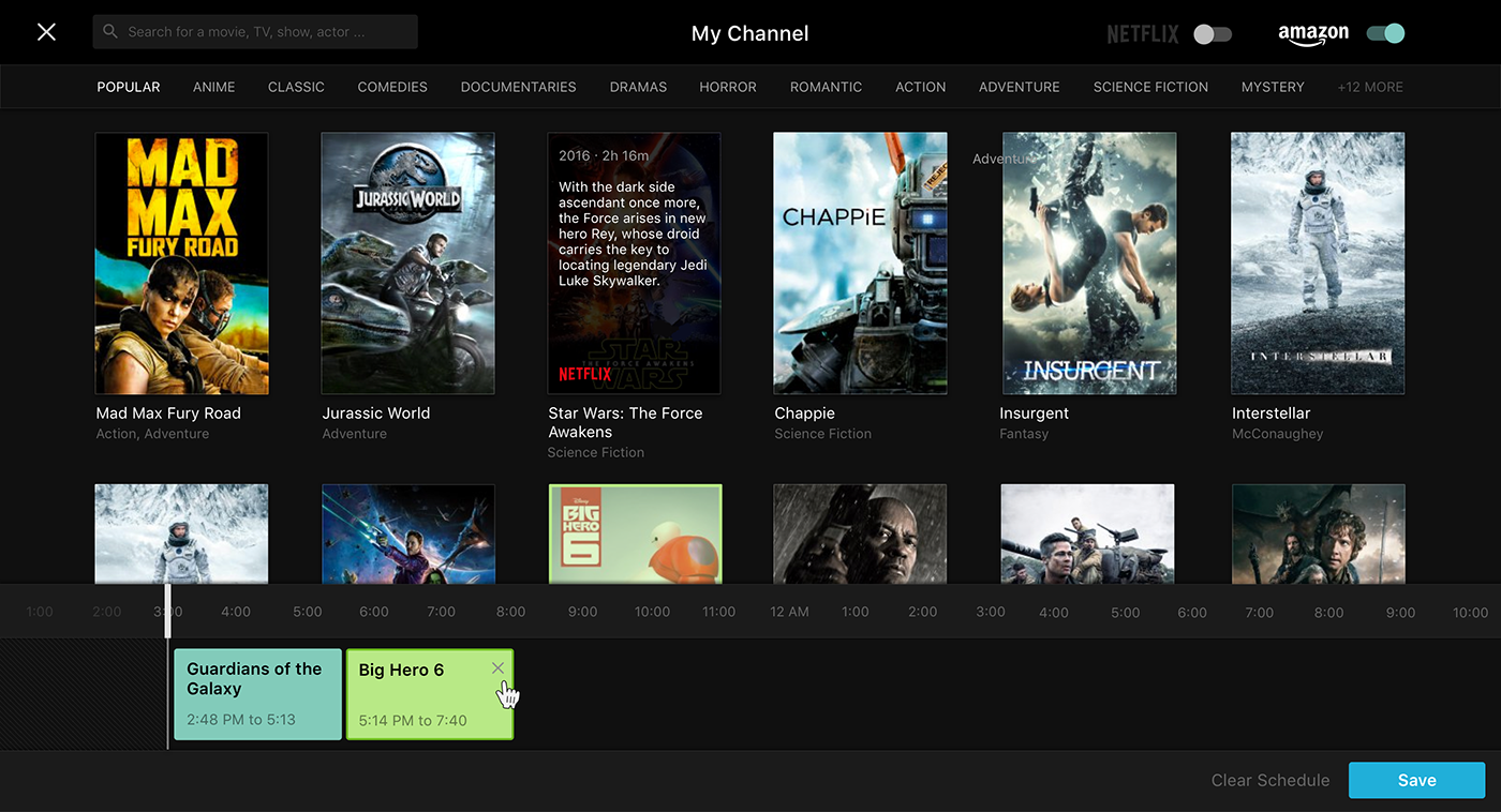
Consuming shows through channel selection presented half of the UX challenges. The other half was the user flow for creating and managing your own channel. This flow had to address a number of items:
- Schedule play times
- Allowing users to watch a specific TV episode or movie
- Encourage niche content curation, allowing streamers to express themselves by virtue of the shows they pick; e.g., showing all Kubrick movies, or selecting only retro noir movies.
Create Channel / Manage Shows UI
The solution was a split interface. The top half was dedicated to providing show selection and discovery (by search, genres, and show popularity / rotten tomatoe ratings). The bottom half was an interactive timeline visualization, allowing dragging and dropping to create the channel's schedule.
Manage Timeslots UI
Watching with Friends
After a user creates a channel or selects one to watch, they reach the core experience of the app: watching a show together. What is normally an individual or implicit social experience (such as watching with friends in real life), becomes an explicit chat room on top of Netflix / Amazon / Hulu.
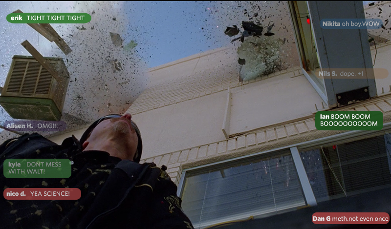
The original chat layout was a spatial chat room, with each user given a dedicated position on the screen. Chat messages were designed to be ephemeral. Without a history of chat messages, users would feel more comfortable to chat without fear of their messages being stored, which would ideally lead to more conversations and raw reactions.
Early Chat Interface
This approach made sense, in theory. By assigning spatial weight to each user, the assumption was that the interface could tap into our brain's spatial processing regions, or that it would feel more like a movie theatre. It worked well with two to four users, but it quickly broke once more people joined. Whatever benefits were gained by instilling a sense of spatial presence was greatly outweighed by the costs. It was difficult to follow conversations, it was hard to simultaneously follow both the show and the text, and it felt like the chat was just a distracting layer instead of a social experience.
Refined Spatial Interface
The next iterations adhered to the idea of spatial "seats," but separated the show and chat. Reaction emojis were also added in the form of tomatoes and claps as a low friction way to engage without typing. This version solved some of the previous issues, but perhaps because of its novelty, or that it deviated from expectations of what a chat room should be, it still fell short. The conversations continued to felt disconnected, and it was just as difficult to focus on the text while watching the movie.
Continuing to iterate, the final version took the good pieces of the previous versions and combined them into a cleaner, simpler interface.
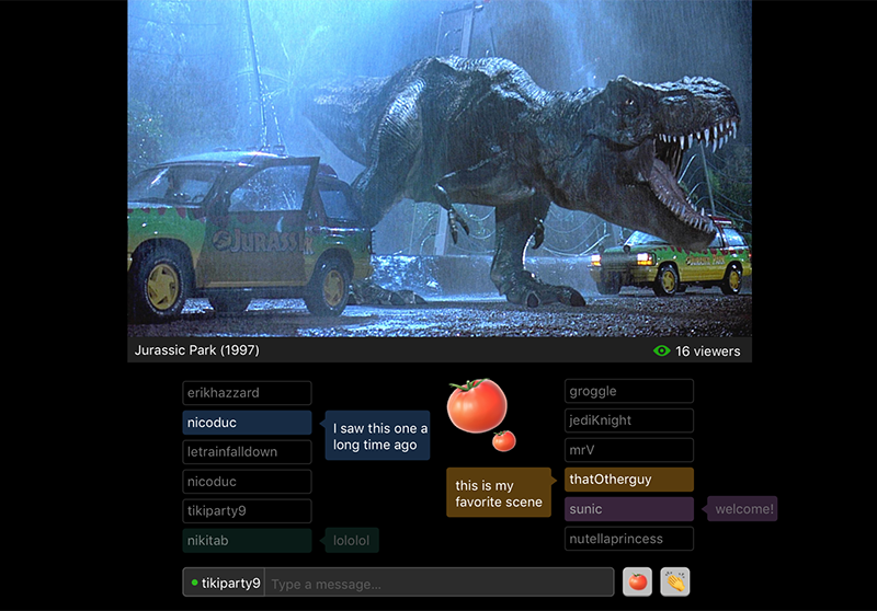
Watch Interface
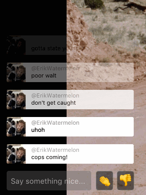
The final version mimics traditional chat room interfaces and is easier to understand. All active users are listed in a centralized location. Spatial presence is lost, but much more is gained. The interface creates a clear, consistent expectation of where you should look to see who is online.
Chat messages are constrained to a single position, which makes following conversations easier. Messages fade out over time, or when new messages push old ones off screen.
Chat Animation
This mixture of traditional chat log plus disappearing messages creates multiple expectations that are in line with Midnight's goals. Because the messages are in a single location and are overlaid on top of the show, it is easier to simultaneously watch both the show and chat. Because the messages fade out, spontaneity is encouraged. Users do not feel like their messages are recored forever, which encourages message sending.
Conclusion
The goal of midnight was to bring back the human component to on demand streaming services. By questioning assumptions, such as the assumption that users should always have control of video playback, we were able to create a platform which encouraged deeper social connections. For many of our friends and acquaintances, Midnight has become the go-to place to watch shows online. The experience is more richer, more enjoyable, and more social. It is currently in beta, so it is yet to be determined if it will reach its goals at scale.
On-demand is certainly a useful tool, but with the content consumption landscape changing so rapidly in the past few years, many opportunities exist to re-examine how we connect to media and to each other.